How to get good website design from AI: from brief to working interface
Neaptide · September 20, 2026 · 13 min read
A practical guide to briefing AI, comparing layouts, choosing images and checking a website interface, with prompts and a fictional workshop example.
On this page
“Build a beautiful, modern website” leaves too many decisions to the model. Who will visit the page? What do they need to understand? What information will help them decide? Without those answers, even an impressive mockup is hard to judge. It may look appealing while failing to do its job.
To use AI well in design, prepare the page content, set visual rules and decide how you will assess the result. This guide is for small business owners, product managers and designers building a website with AI.
What to take from Anshu Chimala’s approach
In How to turn your AI into a world-class designer, Anshu Chimala recommends exploring creative directions, developing the strongest one and refining it through iteration. His techniques include a separate AI critic that reviews a screenshot without the development history, and image generation guided by a specific creative concept.
These are the author’s practical recommendations. His demonstrations do not establish that every project will achieve the same quality. A score such as “9 out of 10” from another model deserves particular caution: it may help compare versions, but it does not show whether a visitor can complete their task.
Our running example is a fictional lamp repair workshop. All briefs, mockups and situations below are educational examples. No user testing results or business outcomes have been measured for them.
Start with the visitor’s decision
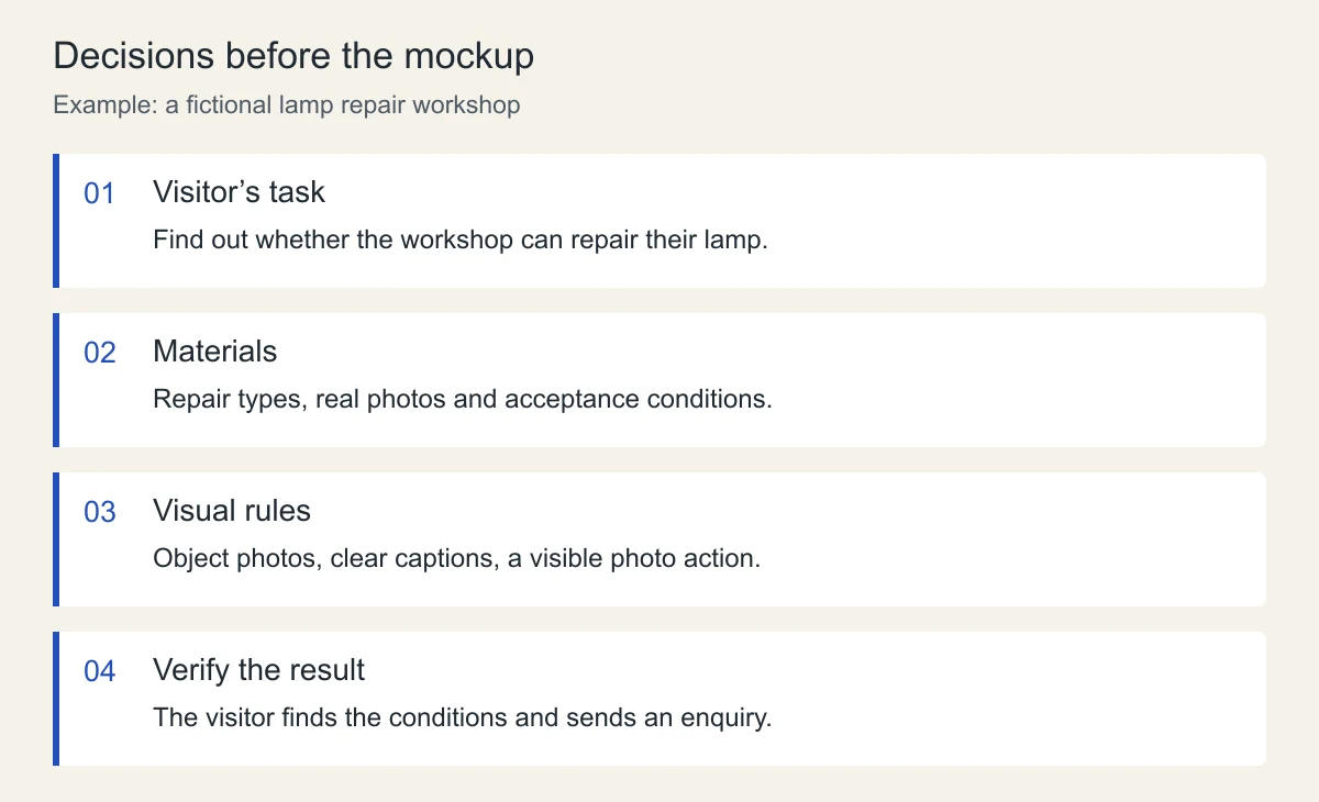
For the workshop, “generate enquiries” is too broad a goal. Visitors need to know whether the workshop can handle their lamp, what to send for a preliminary assessment and how to get the item to the workshop. Those questions determine the page content.
Start with a short instruction:
We are designing a website for a lamp repair workshop. The visitor wants to know whether their lamp can be restored. The main action is to send photographs and a description of the fault for a preliminary assessment. Before doing so, they need to see the types of repair, the enquiry process and the conditions for accepting items. List the materials we need. Identify missing information separately. Do not invent prices, turnaround times, reviews or guarantees.This helps expose gaps before layout work begins. If the acceptance conditions are unknown, get them from the workshop. An attractive section with an invented promise only postpones the problem.
The principle of understanding the problem before developing solutions also underlies the Design Council’s Double Diamond. Its four phases are Discover, Define, Develop and Deliver. Generating mockups covers only part of that process.
Write a brief that supports decisions
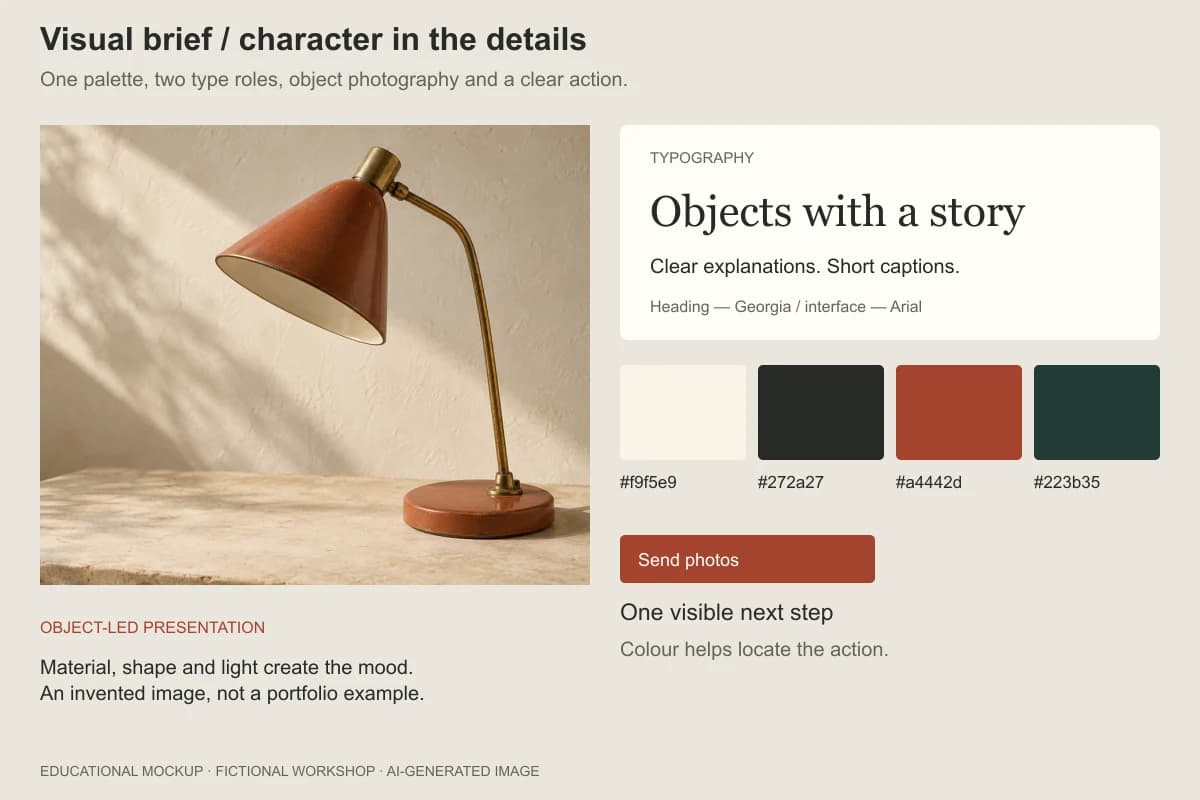
A useful brief connects the visual treatment to the content. For our workshop, we could choose a calm, object-led presentation: large detail photographs, clear captions and a prominent “Send photos” action. This is a proposal for the example, not a universal style for service businesses.
| Part of the brief | Workshop decision | What to check |
|---|---|---|
| Main question | Can you repair my lamp? | The answer or next step is easy to find |
| Content | Repair types, examples and enquiry process | Every section contains real information |
| Visual focus | Photographs of objects and details | Images help visitors examine the work |
| Copy | Short explanations without trade jargon | Visitors know which photos and details to send |
| Main action | Send photos for an assessment | The button opens the right form or contact channel |
| Limitation | A preliminary estimate is not the final price | The distinction is explained near the enquiry action |
Avoid turning the brief into a long list of bans. “No cards” says nothing about how useful the page will be. Cards may work well for a list of services; what matters is the information they contain and whether visitors can compare it.
Compare options using the same content
Prepare one set of headings, services and images before comparing layouts. If one version has strong copy and detailed photography while another uses placeholders, you are comparing several variables at once.
For the workshop, consider three ways to organise the material:
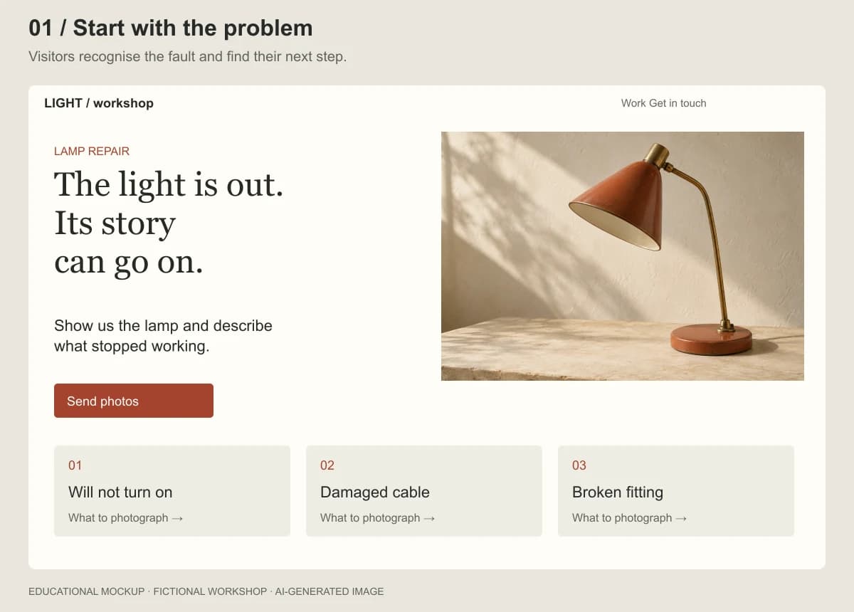
- By type of fault. Visitors recognise their situation and move on to the enquiry conditions.
- By restoration example. Real projects and explanations of the work become the page’s foundation.
- By repair process. The page explains the journey from the first photograph to collecting the repaired item.
These options differ in how they present information, which makes the choice meaningful. You can then discuss page density, image sizes and typography.
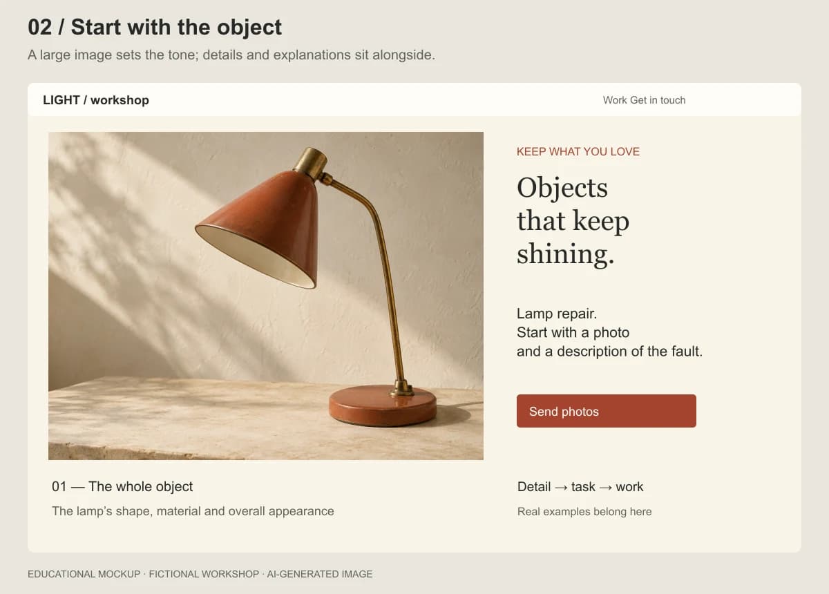
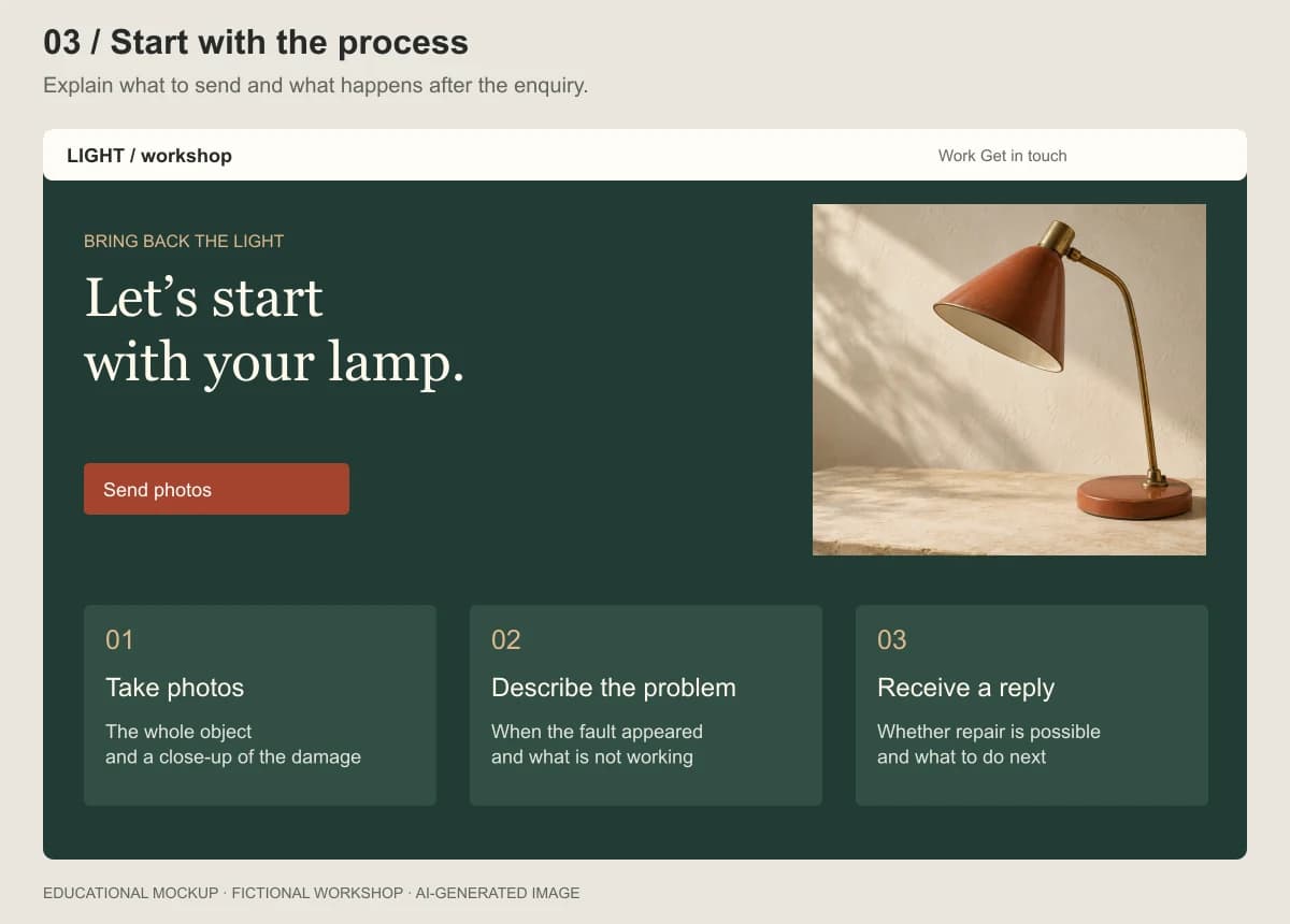
Prepare three page outlines based on these three principles. Use the same source information and main action. For each outline, explain which question it answers first and what information appears further down. Do not add decorative effects yet. Flag any missing materials that prevent a decision.The three original mockups below explore the same subject. The first foregrounds faults, the second the object itself, and the third the enquiry process. Their palettes and compositions also differ: they illustrate possible directions, not a controlled experiment. To test structure alone, keep the styling and content consistent.
Ask someone who was not involved in the design to find the acceptance conditions and explain the next step. If they cannot, revisit the structure. Their colour preferences are a separate issue.
Can a random string help generate ideas?
If the options look too similar, an unusual source of associations may help. Chimala suggests generating a random string with an external script and using it as a starting point for design. Treat this as an experiment, not a mandatory step. Source: Lenny’s Newsletter.
Sakana AI researchers describe a method called String Seed of Thought: the model generates a string and then performs operations on it to construct an answer. Their research concerns probabilistic instruction following and output diversity. Their method does not require an external generator, unlike Chimala’s practical variation.
These findings do not establish that random strings improve website usability or sales. For a working project, ask a narrower question: did the experiment produce an option that serves the task and deserves further development? If not, set it aside. Novelty alone is no reason to replace understandable navigation.
Choose images according to their role
A photograph of a repaired lamp can demonstrate the workshop’s actual work. A generated image cannot serve that function: there is no real order or completed repair behind it.
Separate images by purpose. A portfolio needs genuine photographs with permission to use them. An original diagram can explain how to make an enquiry. A conceptual illustration can establish the mood or serve as a cover, provided its origin is clear.
Before generating an image, decide where it belongs. Check it alongside the heading if they will appear together. If it will be cropped on a narrow screen, ensure the important detail remains visible. Keep text, buttons and service conditions as ordinary page elements so they can be edited and adapted separately.
For the example project, the instruction could be:
Create a diagram explaining how to request a preliminary lamp assessment. Three steps: photograph the whole object, take a close-up of the damage, and describe what is not working. Keep captions as ordinary page text. Do not present invented workshop projects as its portfolio.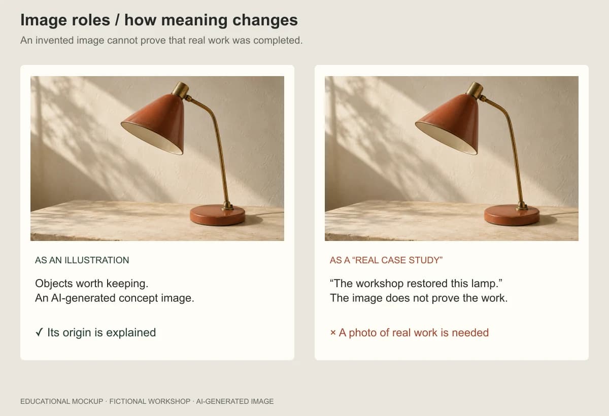
Turn feedback into verifiable changes
“This looks cheap” does not explain what to change. Useful feedback identifies a location, a problem and the expected result after correction.
| General impression | Actionable revision |
|---|---|
| The page is too busy | Identify sections that repeat information. Suggest what to combine and explain what will be retained |
| The button gets lost | Check whether visitors can find photo submission after reading the conditions. Show an option with the action beside them |
| It is awkward on a phone | Check the form at a narrow width: labels, wrapping, keyboard, error messages and submission |
| The photos do not help | State what each photo explains. Replace vague captions with concrete descriptions of the work |
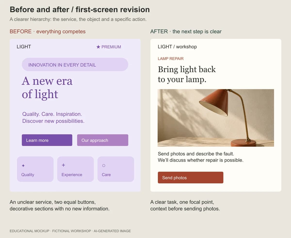
You can ask AI for a preliminary review. Give it the visitor’s task, the brief and the current screen. Ask it to separate visible problems from assumptions that require a working website. A screenshot supports composition review, but cannot verify form submission.
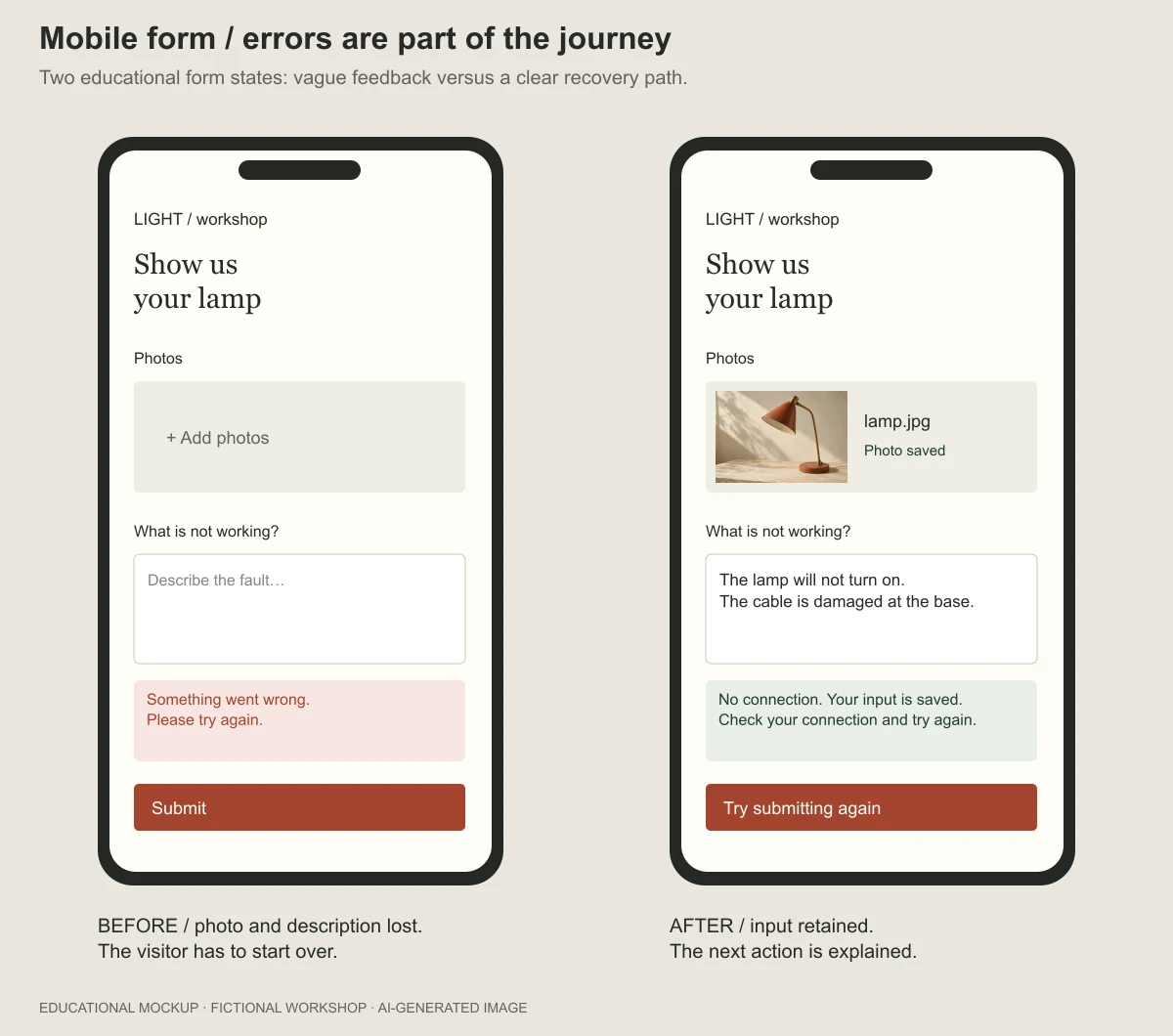
Keep a short change log: what you observed, what you changed and how you checked it. For example: “The fault description disappeared after a failed submission → retained the entered text → repeated the failed submission and confirmed the description remained.” That record is more useful than an increasing beauty score.
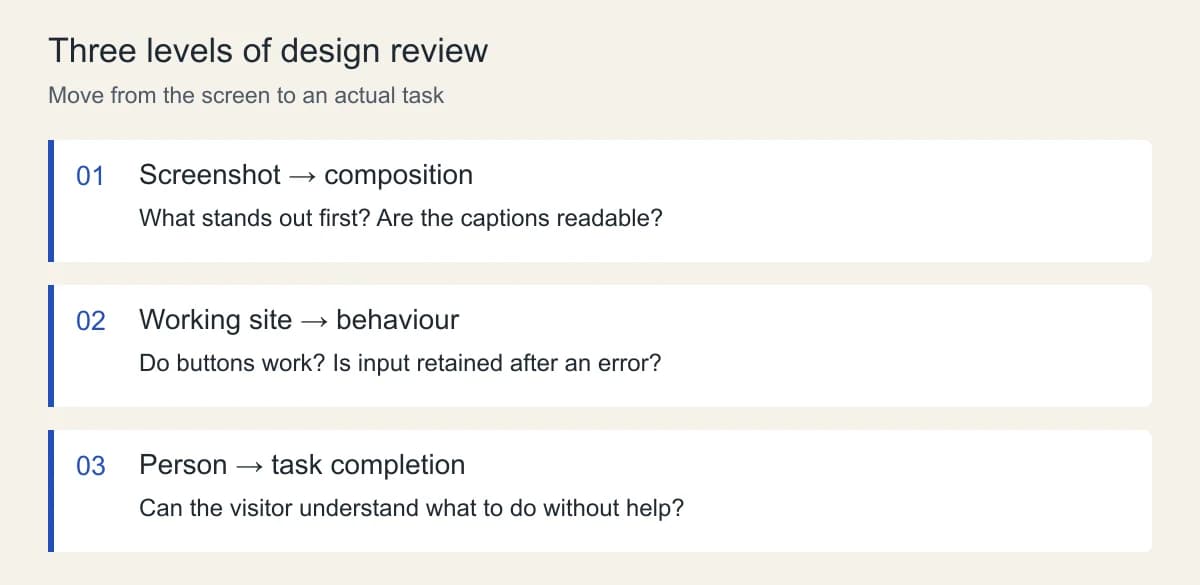
Test the interface where people will use it
Before launch, complete the main journey end to end. For the workshop, that means finding the conditions, preparing photos, filling in the enquiry, correcting an error and receiving a clear confirmation. Test more than the successful path: empty fields and failed uploads also need understandable responses.
Check readability and controls separately. WCAG 2.2’s level AA contrast criterion requires at least 4.5:1 for normal text and 3:1 for large text, subject to specified exceptions. Large text means at least 18 pt, or 14 pt when bold. Check the actual foreground and background colours rather than judging the image by eye. W3C guidance on criterion 1.4.3.
For pointer targets, level AA criterion 2.5.8 specifies a minimum of 24 × 24 CSS pixels, with exceptions including sufficient spacing around smaller targets and inline text links. This is the criterion’s minimum, not a recommendation to make every button exactly that size. W3C guidance on criterion 2.5.8.
Passing these two checks does not establish conformance with the entire standard. Also navigate using a keyboard, check visible focus, field labels and enlarged text. Then give someone from the intended audience a specific task without coaching. Record where they hesitate and what they interpret differently from you.
Decide when to stop refining
For the workshop’s first version, write down the acceptance conditions in advance: visitors can find the repair types and acceptance conditions, understand what to send, complete the enquiry, retain their input after an error and receive confirmation. Every published promise must match the workshop’s actual process.
Once those conditions are met, tie further changes to observations. Confusion between a preliminary estimate and the final price is a reason to rewrite the explanation. An inability to attach a photo is a reason to fix the form. Trying another shade can wait.
Start with one journey and make it work. That gives you a concrete basis for the next conversation with AI: a problem you can point to and a way to check whether it has been resolved.
- Build a business website with AI: from the brief to testing enquiries
- Website development at Neaptide
Sources
- Anshu Chimala — How to turn your AI into a world-class designer, Lenny’s Newsletter, 1 September 2026. Original article. Only the publicly accessible portion was used; the subscriber-only continuation was not reviewed.
- Design Council — The Double Diamond. Process description. Supports the distinction between understanding a problem, developing options and testing solutions.
- Kou Misaki, Takuya Akiba, Sakana AI — String Seed of Thought: Prompting LLMs for Distribution-Faithful and Diverse Generation. Method and experiments. Source for output diversity and probabilistic instructions.
- W3C — Understanding SC 1.4.3: Contrast (Minimum). Text contrast.
- W3C — Understanding SC 2.5.8: Target Size (Minimum). Target size and exceptions.
Sources checked on 20 September 2026. The workshop brief, prompts, tables and diagrams were created for this article. They describe a proposed workflow, not an experimental report.