How to create AI images for a website: from first draft to working banner
Neaptide · September 6, 2026 · 8 min read · Updated: October 3, 2026
Follow a pottery studio example to write image prompts, leave room for a headline, create a mobile composition and keep a consistent visual style.
On this page
A picture can look lovely on its own and still get in the way on a website. The mug lands behind the headline, the background fights the text, or a narrow screen cuts off the handle. Start your prompt with the image’s job on the page.
To create a website image with AI, tell the generator the image’s purpose, subject, composition, lighting and constraints. Test what comes back with the real text at desktop and mobile widths. Then sort out the file size and the alternative text. This guide walks through all of that with one example.
What we made for this guide
We created four images of fictional ceramics using the built-in image generation tool: an initial image, two successive edits and a new bowl using a style reference. This is a Neaptide editorial exercise dated 6 September 2026. It is neither a client project nor a model comparison. The tool did not expose a model identifier or seed. The prompts below are reproduced exactly as submitted, though they may not give you identical results.
Give the image a place in the layout
On our pottery studio’s page, the heading and button sit on the left and the mug on the right. A blog thumbnail is another matter: its subject has to stay recognisable when small. A product listing has to show the actual item accurately. All three ask for pottery, and each is a different brief.
The first prompt: attractive, but too central
Create a wide landscape photograph of a handmade ceramic mug for a pottery studio website. Warm daylight, natural linen, tasteful editorial product photography. No text, logos or watermark. Save the generated image.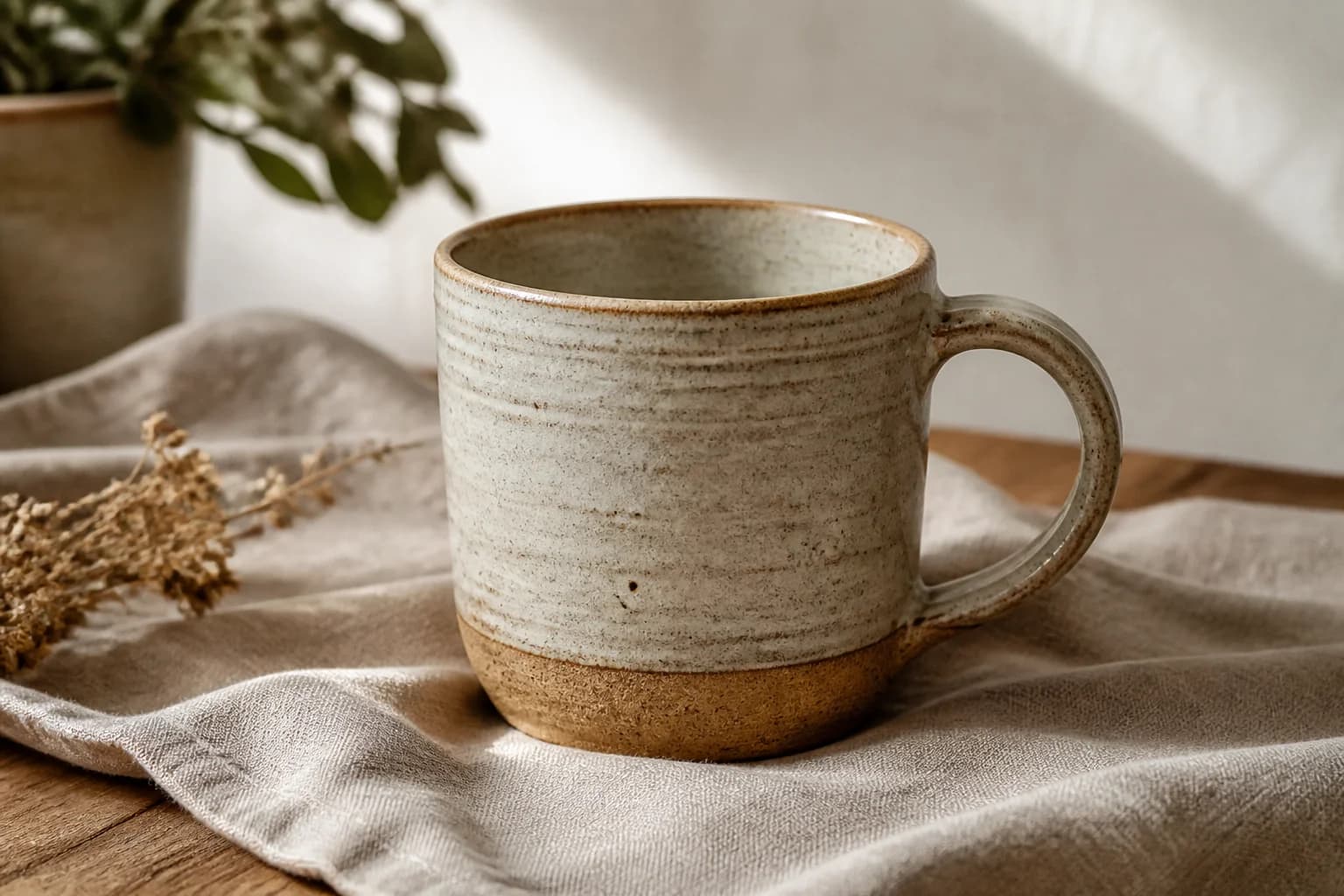
We specified the mood and the materials and said nothing about composition, so the generator added a plant and some flowers. As a picture it works. As the banner at the top of our page it needs less going on at the left and a smaller mug, or there is no room for text.
Edit the composition to make room for the heading
Use the first image as the starting point for the edit. Say what should move and what should stay: the mug goes right, the decoration goes, the materials and the light stay broadly as they are.
Edit the supplied generated mug image for a pottery website hero. Make a wide 3:2 landscape composition. Keep one recognizably matching cream speckled ceramic mug with the same brown unglazed foot and curved handle, the linen, warm daylight and natural photographic style. Reframe so the complete mug including handle sits in the right third and occupies at most 40% of the image width. Leave the left half a quiet light warm off-white surface with very little texture for a dark HTML heading to be added later. Remove the plant and dried flowers. No lettering, logos, border or watermark. The mug is a fictional design for an educational example.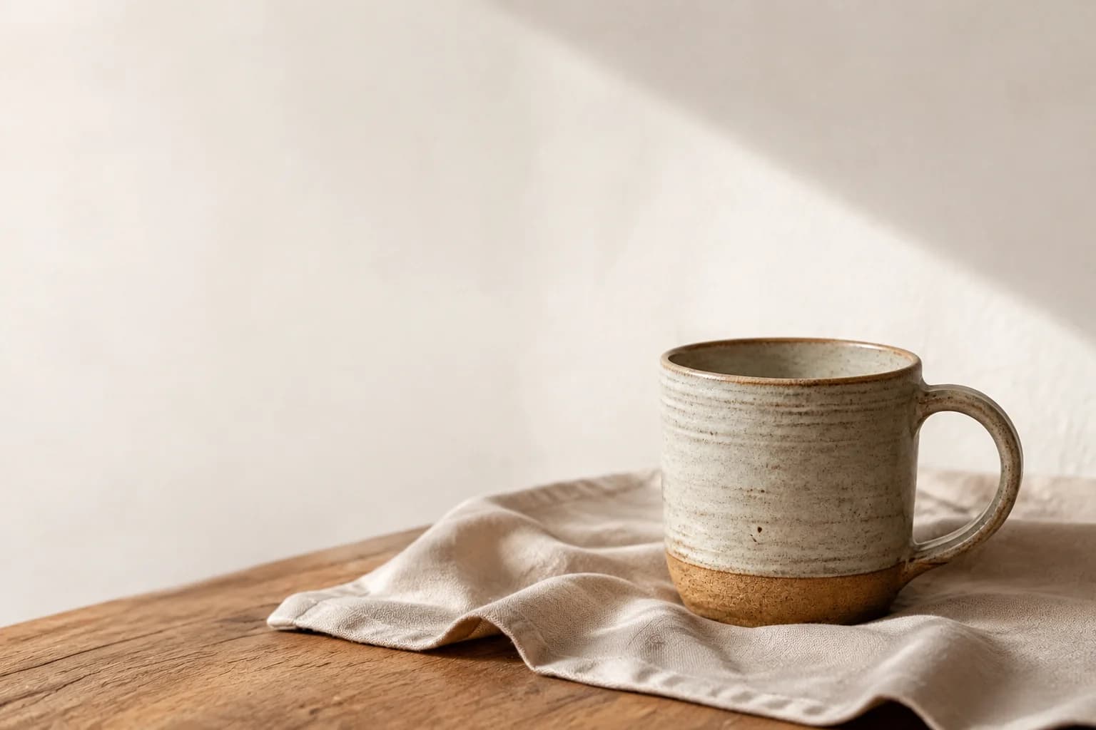
The handle and proportions also changed slightly. That is acceptable for our fictional prop. A real product would need checking against its source photograph, because asking a generator to preserve an object does not mean it will.
Add the heading and button in HTML, so that they can be selected, translated and changed without touching the image. Then judge the image in the layout. The file on its own tells you little.
Mobile needs a composition check
Crop a wide banner at the centre and you can lose the handle, or the whole mug. Try showing the full image first, with the text above it. If the layout really does call for a portrait image, prepare a separate composition.
Edit this generated pottery hero into a portrait 2:3 mobile website image. Use the input image as the edit target. Keep a recognizably matching single cream speckled ceramic mug, brown unglazed foot, right handle, warm daylight, pale wall, wooden table and linen. Place the complete mug and handle in the lower half, comfortably inside both side edges. Keep the upper 40 percent quiet pale wall for dark HTML text to be added by the website. No plant, flowers, text, logos or watermark. Preserve the restrained photographic style. This is a fictional product for an educational website example.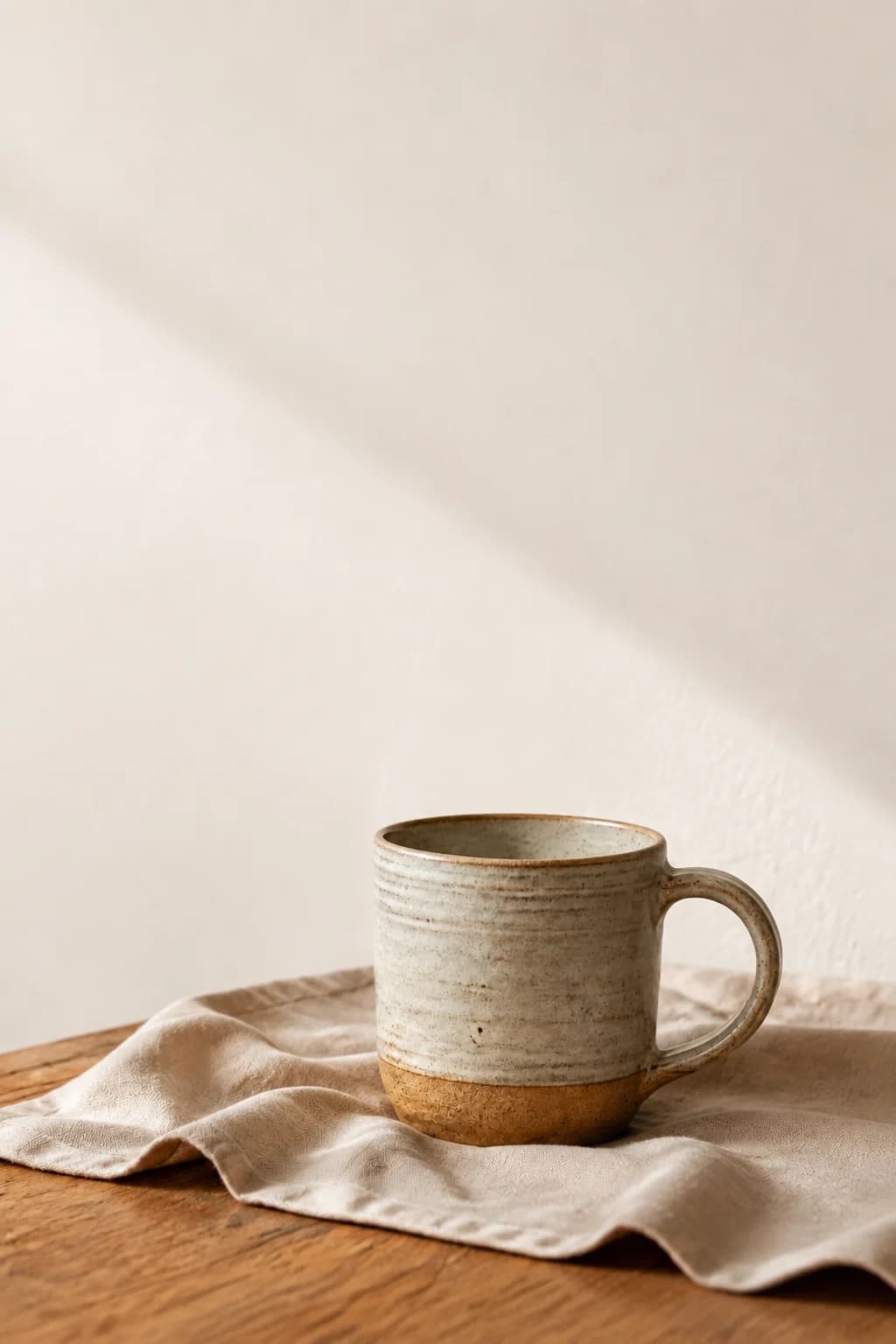
To show different compositions at different screen widths, use the HTML picture element, with source elements that say when each image should appear. Where the composition stays the same and only the resolution varies, srcset and sizes will do. The demo lets you compare a centred crop of the wide image with the separate portrait version.
Build a recognisable series
For a second article, we need a bowl. Supply the mug image as a style reference and say that the object itself is new. The linen, wood, warm light and restrained palette carry over. Only the subject changes.
Create a new square editorial image for an educational pottery studio blog, using the supplied image ONLY as a style reference, not an edit target. Show a single shallow handmade ceramic bowl, cream speckled glaze with a brown unglazed foot, fully visible on natural linen over a wooden table, pale warm wall, soft window daylight, restrained warm neutral palette and quiet photographic texture matching the reference. Bowl in lower right area, simple upper left background, no other pottery, no plants, flowers, people, text, logos or watermark. The bowl is a fictional design, not a real product photograph.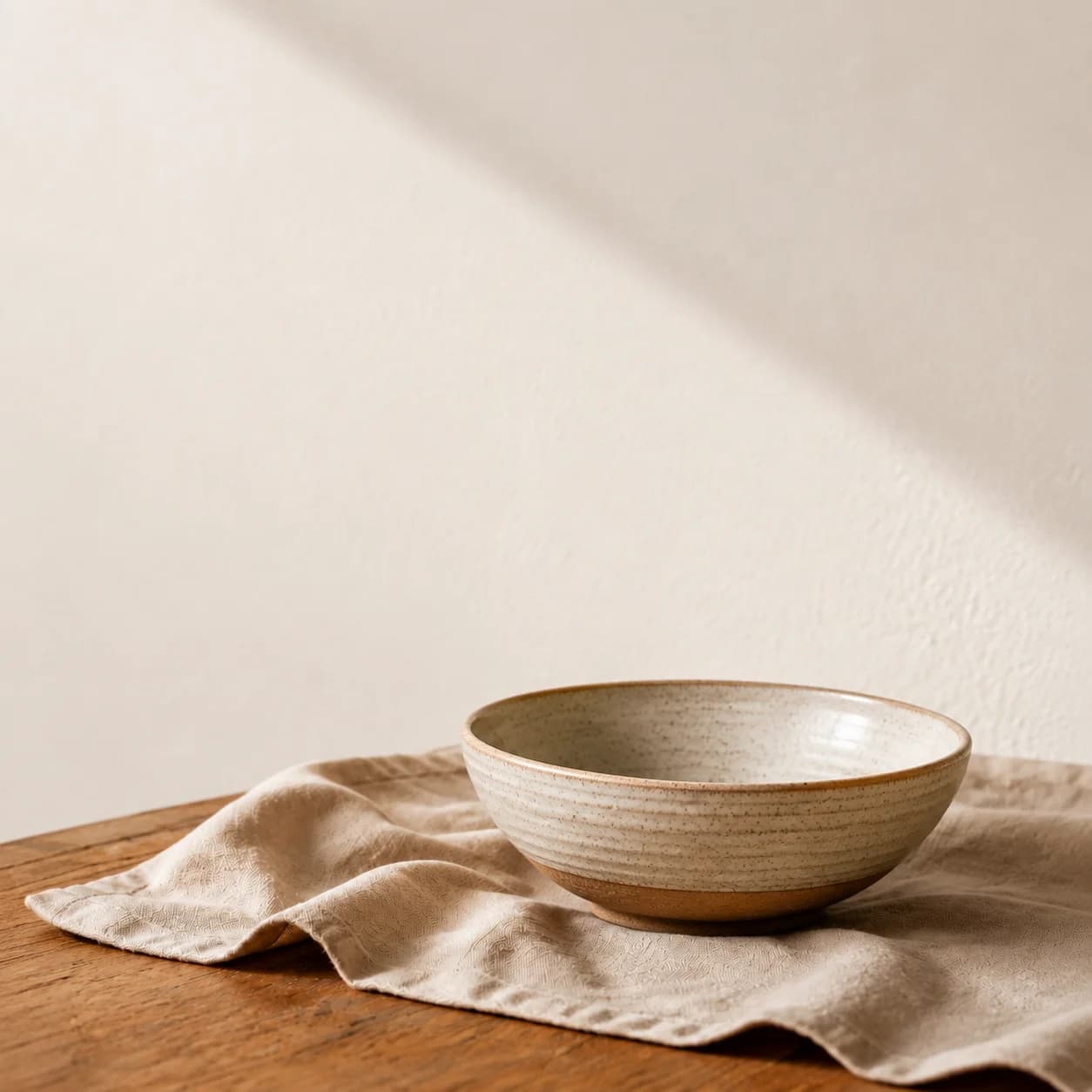
Keep your chosen reference alongside a short style brief. Compare the images side by side, because repeating a colour name does not guarantee matching tones.
Fix specific problems
- Subject behind the heading: name the area that must remain clear.
- Busy background: say which objects should go.
- Product details have changed: go back to the source photo, restrict the edit and inspect again.
- The series does not hang together: reuse one style reference and one lighting brief.
- Edits keep drifting: go back to the last version that worked.
Prepare the image for publication
Our WebP files are approximately 189, 89, 71 and 80 KiB. Those are the sizes we got at our chosen quality and should not be read as targets. Inspect edges and texture after compression, and set image width and height to reserve layout space.
Write a short, descriptive alt attribute, for example ‘Mug on linen at the right, with space for a heading on the left’. The caption can explain what the edit was for. A purely decorative image can have empty alt text. Google recommends placing images near relevant text, giving files meaningful names and writing useful alt text without keyword stuffing. Put the lesson into ordinary text as well, so that it still makes sense without the image.
Before you publish
- Place the image beside the real heading and button.
- Check wide and narrow screens.
- Compare any real product with its source photo.
- Inspect compression and loading.
- Add alternative text and a caption, and save the prompt with the source image.